Topics: Freight Audit & Payment, Parcel shipping, Parcel Spend Management, Transportation
Summary
Dashboards transform parcel spend management by replacing rows of raw data with clear, interactive insights. Instead of spending hours building reports, you can quickly see where costs are concentrated, how carriers are performing, and what savings opportunities exist. CassPort brings these insights together in one place, making it easier to drill down, apply filters, and export details so you can focus less on spreadsheets and more on decisions that move your business forward.
We're about to delve into the value of visualization in parcel spend management. Dashboards don't merely serve as eye candy; they provide quick insights, enable informed decision-making, and bring a level of engagement and understanding that rows and columns of raw data simply can't offer.
Beyond their visual appeal, dashboards are highly interactive, allowing users to drill down for deeper analysis, apply filters for targeted insights, and conveniently export data for further use. This interactivity transforms them into powerful tools for detailed exploration and customized reporting tailored to the specific needs of each user.
- Do carriers agree with us on package weight?
- Which carrier performs best for on-time delivery in a given zone?
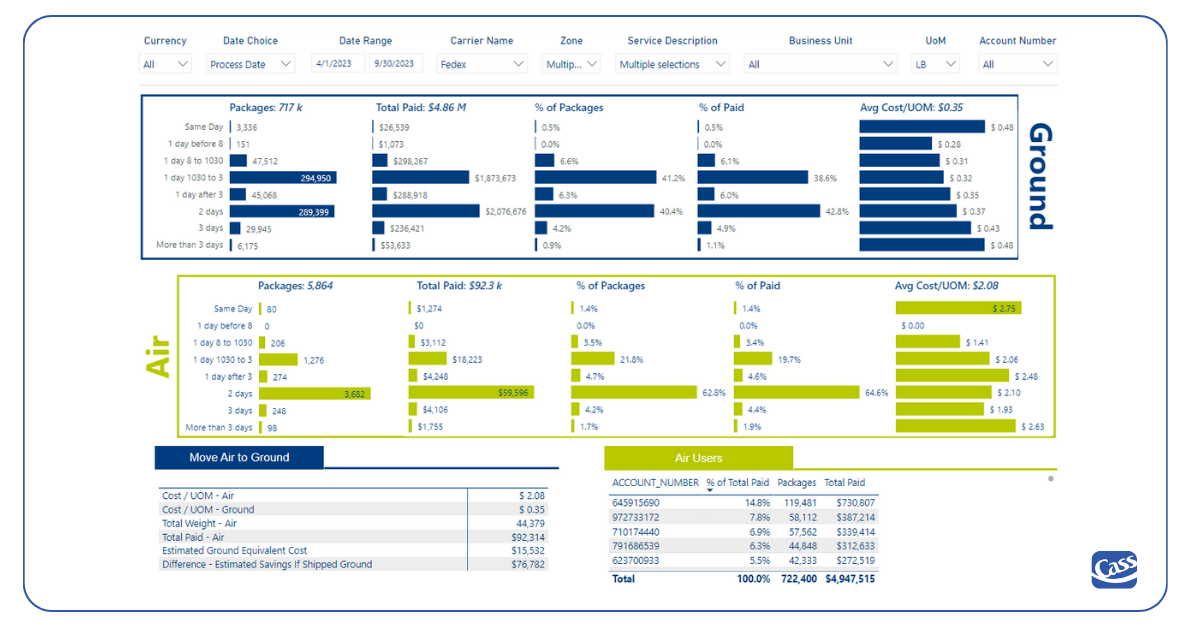
- Could we save money with little impact on delivery performance if we shift air activity to ground?
- Which shipping locations are purchasing insurance (and at what cost)?
The Power of Visualization in Parcel Spend Management
We know your life involves endless spreadsheets, with hours spent each week pulling data from multiple sources and creating pivot tables and charts. Dashboards offer the benefit of summarizing the data for you, so you can make decisions without the thousands of line items and pivot table battles. It's all been done for you.
6 Essential Cass Dashboards for Effective Parcel Management
We continue to invest in business intelligence tools for an obvious reason: the value of the data derived from parcel and other freight invoices is enormous. Our customers include the world's largest shippers, and a few things are universally true about them: their activities revolve around data, but their resources for analyzing and acting on data are incredibly stressed. The easier we can make it to access digestible data, the more likely they are to know what needs to change, and then take action.
Here's a peak into some of the dashboards our customers use every day on CassPort, our business intelligence platform.
1. Overall Parcel Activity
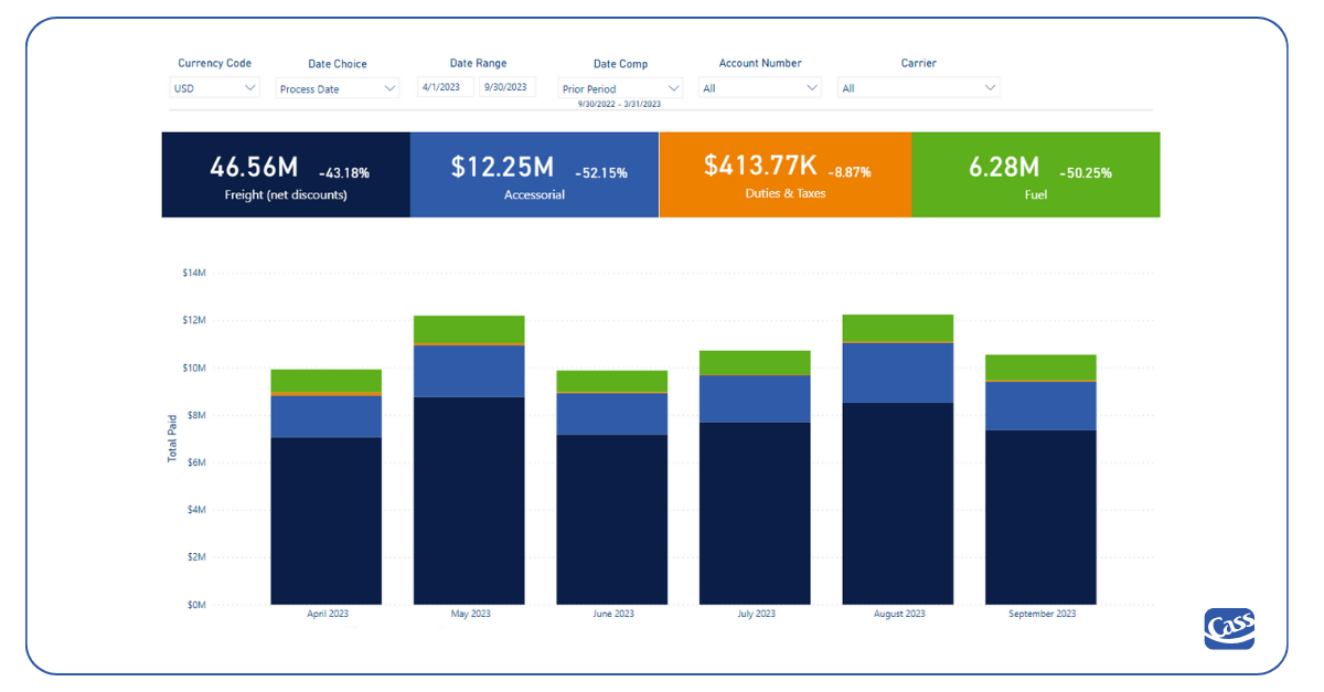
Use our simple Parcel Activity dashboard to compare your spend by charge type over various time periods. Drill down to one carrier or account number, and export the details to really dig in.
2. Accessorials and Additional Fees
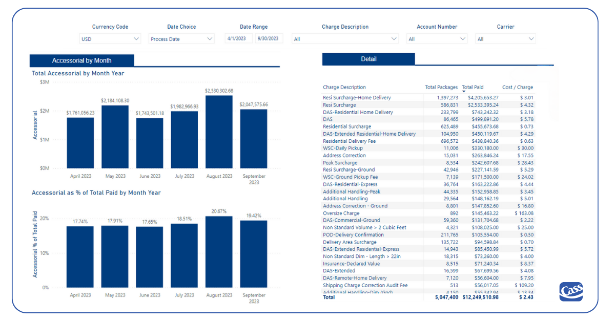
Surcharges make up a large percent of your total spend, so you need to know how they’re impacting your budget. This dashboard is a financial microscope. Visually, see your accessorials as a percent of total spend. (Are you wondering what happened in August, below?). Hover, click, or change the filters to go deeper. Export the data and find answers and opportunities.
3. On-Time Delivery
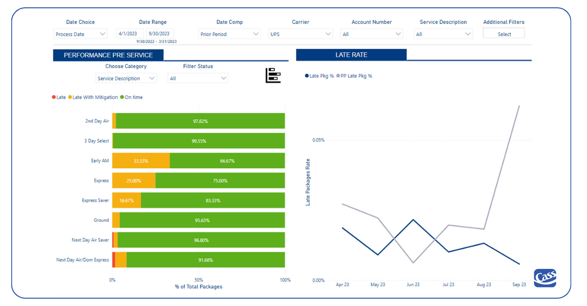
See the delivery performance of your carriers, filtering by zone/service description/delivery group, and more. Want the details? Export every package that feeds your selections.
4. Parcel Audit Savings
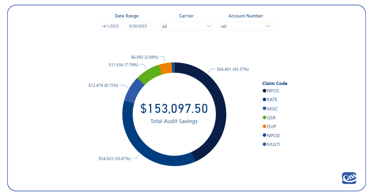
Invoice audits are important to you. Come here to see how much you’ve saved through charge-level audits.
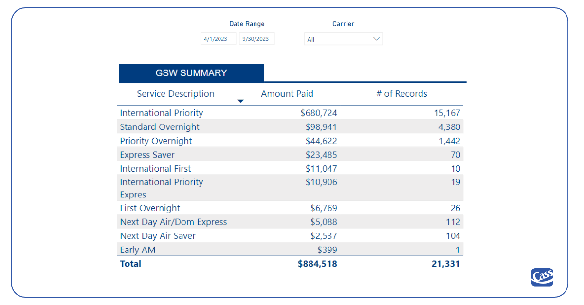
5. Guaranteed Service Waiver (GSW) Loss/Opportunity
If you have a Guaranteed Service Waiver, this dashboard helps you finally determine if it’s worth it. See the amount you could have claimed if the waiver weren't in place.
If you don’t have a waiver, this shows how much you recovered due to service issues.
6. Air vs Ground Scenarios
Do you know what would happen if you shifted air shipments to ground? Use this premium analytics dashboard to find out. Filter by carrier, business unit, account number, and more, and you'll see how costs and service levels would change.
By leveraging these dashboards, you'll have a powerful toolkit to navigate the complex landscape of parcel management more efficiently and effectively.
Keep reading about more insights a parcel spend management solution delivers.

